
Brand Book
Draft v5 · June 2026 · Internal use only

This document defines the visual language of Human Interest — how we look, how we communicate, and how we show up consistently across every touchpoint. Use it as a reference, not a constraint. Good judgment still applies.

10 sections covering brand identity, typography, color, photography, and web system
Web System section covers digital-specific rules including accessibility, component specs, buttons, UI representation, and pull quotes
Google Fonts: Lora (headlines) and Manrope (body) — both free and available in Google Fonts
Questions? Reach out to the brand team before deviating from these guidelines
Brand foundation

Brand Voice

Human Interest shows up as a confident challenger — specific, plain-spoken, and grounded in proof. We don't lecture or warn; we show employers a world where businesses like theirs are already winning. The employer is always the hero. We're the guide that makes it possible.

Bold & Substantive
  • We show up as a confident challenger — specific, direct, and grounded in proof.
  • We lead with data and real customer evidence, not marketing language.
  • Visually, we make confident choices: bold typography, specific numbers, clean layouts that let the proof do the work. We don't decorate — we demonstrate.
Human
  • We speak plainly and design simply. No jargon, no complexity, nothing that makes an employer feel like this wasn't built for them.
  • Our expertise shows up in clarity — both in the words we choose and the interfaces we build.
  • We communicate with purpose and say only what matters.
Optimistic
  • We show employers a world where businesses like theirs are already winning.
  • We invite rather than warn, encourage rather than pressure.
  • Visually, we use warmth — light, open design, imagery of real people and real businesses — to signal possibility rather than complexity.
  • We're warm without being soft. Encouraging without being cheerful.
Brand identity

Colors

Primary Palette
Human Interest Navy
RGB 2 42 76
Hex #022A4D
CMYK 100 63 12 67
PMS 7463 C
Human Interest Teal
RGB 20 181 171
Hex #14B5AB
CMYK 81 0 39 0
PMS 326 C
White
RGB 255 255 255
Hex #FFFFFF
CMYK 0 0 0 0
Secondary Palette
#F8CE92
#F8CE92
#000025
#00585B
#15A29B
#8FD5D1
#E5F4F3
Gray Palette
#0E101E
#1B1E2D
#363B49
#515966
#6C7682
#87939F
#9FA9B2
#C3C9CF
#DBDFE2
#EFF1F4
Online (digital & web) Accessibility — Teal Usage

These rules apply to all digital presentations inclduing emails, website, digital ads, etc. Human Interest Teal (#14B5AB) has three functional variants for digital use. Each meets WCAG AA contrast requirements on its intended background. Using the wrong variant fails accessibility standards.

Text on white
Text on white
#009A91
Teal body copy, links, and labels on white or light backgrounds.
WCAG AA ✓
Text on navy
Text on navy
#69C2BA
Teal text on navy backgrounds only. Never use on white — fails contrast.
WCAG AA ✓
Get started
Accent / UI only
#14B5AB
Icon fills, borders, UI accents, and Atmosphere gradients only. Never as text color.
Accent only
Teal variant quick reference
#009A91 — teal text on white or light backgrounds (AA compliant)
#69C2BA — teal text on navy backgrounds (AA compliant)
#14B5AB — CTA fills, icon accents, gradients, UI elements — never as a text color on any background
Brand identity

Background "Atmospheres"

Radial gradients are a cornerstone of our brand image. Atmospheres are their named application — each maps to a specific content type and emotional register. They frame content; they never compete with it.

Named "Atmospheres"

One Atmosphere per section. No overlapping.

Horizon
#F8CE92 upper right · #14B5AB lower left → White
Hero and above-fold sections. Yellow upper-right, teal lower-left — both pulled off-canvas with clear white space between them. Never let the two gradients touch.
Clarity
#14B5AB → White
Feature and FAQ sections. Teal on white — clean, focused, informational.
Warmth
#F8CE92 → White
Testimonial and award sections. Yellow on white — earned, human, personal.
Depth
#022A4D → #14B5AB
Dark feature sections. Navy background with teal halo — stable, grounded, trustworthy.
No other combinations permitted
Out of System
Do not mix navy with yellow, introduce new gradient colors, or overlap two Atmospheres.
Application rules
One Atmosphere per section — gradients never cross section boundaries
Center point always outside the visible canvas — never show a complete ellipse
Always leave a clear content safe zone — gradients frame, never sit behind text
Ovals on angles are fine — "radial" does not require a perfect circle
Yellow and teal gradients on white only; navy gradient on navy only
Atmosphere: Depth uses the navy radial — navy background with teal halo
Check logo placement — teal dot vibrates on yellow, disappears on teal
Gradients must never overlap — keep one per section with clear separation
Brand identity

Typography

Headlines & Display — Lora
Give your
employees
the best.
All titles, headlines, quotes, and blurbs. Regular (400) weight in all cases, never bold.
Lora Regular 400 — all headline use
Body, Subheads & UI — Manrope
We handle the 401(k) things — compliance, payroll sync, employee support — so you can focus on running your business.
Why Human Interest
Body copy, subheads, UI labels, nav, captions, FAQs, buttons, eyebrows. All text 20px and below.
Manrope Regular 400 — body copy Manrope SemiBold 600 — subheads, links Manrope ExtraBold 800 — eyebrows, tags
Above 20px → Lora
Hero, H1, H2
24 · 28 · 40 · 48 · 56+px
20px and below → Manrope
Subheads, body, UI
11 · 12 · 14 · 16 · 18 · 20px
RoleFontSize / WeightExample
HeroLora Regular 40056px · lh 1.05
Highest-rated 401(k)
H1Lora Regular 40040px · lh 1.1
You run your business.
H2Lora Regular 40028px · lh 1.2
Common questions
H3 / SubheadManrope SemiBold 60020px · lh 1.3
Design your plan
EyebrowManrope ExtraBold 80011px · uppercase · ls 2px
Why Human Interest
BodyManrope Regular 40016px · lh 1.7
We handle the 401(k) things so you can focus on everything else.
UI LabelManrope SemiBold 60014px · lh 1.4
Plan for my business
CaptionManrope Regular 40012px · lh 1.6
Trusted by 10,000+ small businesses
Teal headline emphasis
Give your employees the highest-rated 401(k)

Selective teal (#14B5AB) applied to one phrase within a Lora headline only. Hero-level headlines only. Never in body copy or subheads.

Lora headlines only
One emphasized phrase per headline maximum
Never apply to Manrope body copy or subheads
Never emphasize more than one phrase per headline
En dash usage

When using an en dash ( – ) anywhere in copy — headlines, body, captions, UI labels — always include a space before and after it. This applies globally and must be consistent throughout every document, page, and template.

✓ Correct
Simple, affordable – and built for you.
Space – space around the en dash
✗ Incorrect
Simple, affordable–and built for you.
No spaces — do not use em dashes either
Brand identity

Photography

Hero image direction

Our hero photography has one job: make the viewer feel seen. Every image should capture a person who has just realized their problem is understood and under control — warmth and confidence, not performance.

Hero images feature a single person making direct, warm eye contact. The subject has just noticed they've been seen — not posed, not selling. The expression sits at the intersection of relief and quiet confidence: someone finally gets it. Natural light, real environments, no staging.


Latina woman at office desk
Example · Office
Natural light, open office. Warm eye contact without posing. This is the brand's emotional default.
Black man, shop owner, retail store
Example · Retail / Small business
Real shop floor, natural window light. The smile is earned, not performed — a business owner in his element.
Woman in open plan office
EXAMPLE · Office
Relaxed, collaborative background. Natural expression. Clean and believable.
Florist in flower shop
EXAMPLE · Small business
Real environment, apron grounds her as a business owner. Warm, unguarded. The HI customer.
Black woman at workstation
EXAMPLE · Tech/office
Confident and composed. Natural hair, warm setting, collaborative background.
Hero subject cutout

Whenever possible, hero subjects are partially masked out of their original photo and placed on the page or an Atmosphere gradient. This convention will separate hero images from supporting secondary images, which can be contiained fully in a rectangular shape.

Hero subject cutout example
1
1
Feathered cutout edge

The subject is cut out with a soft edge that dissolves to transparent — not a hard rectangle, no drop shadow. The mask follows the top of the head, so the edge reads as a natural fade rather than a sticker cut from a photo. This is what lets the same hero subject sit on a flat white page, a photographic background, or an Atmosphere gradient without ever looking pasted in.

Cutout rules
Edge fades to transparent — no drop shadow, no glow
Mask follows top of subject’s head
Approved to sit on white or on an lighter Atmosphere gradient
Secondary image examples

Secondary images capture real, unposed moments. Subjects are absorbed in their work or conversations — never looking at or performing for the camera. The viewer feels like they're observing something genuine, not staged. Real people in real work environments. The energy of an actual moment, not a posed group portrait.


Woman laughing at her tablet, not looking at camera
EXAMPLE · Open office
Caught mid-laugh, eyes off camera. Candid and unposed — the viewer is observing, not being addressed.
Woman smiling at colleagues, not looking at camera
EXAMPLE · Team moment
Genuine exchange with colleagues just out of frame. The viewer is a fly on the wall, not the subject's focus.
Advisor meeting with client, reviewing a tablet
EXAMPLE · Advisor meeting
Builds the world around the product — two people absorbed in a real conversation, no acknowledgment of the lens.
Team meeting around a table, no one looking at camera
EXAMPLE · Team meeting
Diverse group, mid-conversation. The energy of a real working meeting, not a staged group portrait.
Secondary image rules
Subject never looks at the camera — reserved exclusively for hero images
Shown as a full rectangular crop — no feathered cutout treatment
Subject is absorbed in real work or conversation, not performing for the lens
Set in a real, identifiable place of work — no neutral or abstract backgrounds
Always shows someone reacting to or working with other people — never a person alone
Photography roles
Hero images
Direct eye contact · Single subject

The subject has just noticed they've been seen — warmth and quiet confidence, not performance. This is the "someone finally gets it" moment. Direct eye contact is required. The person looks like their problem is understood and under control. Expressions sit between relief and assurance. Always shot in a real place of work: office, kitchen, shop floor, restaurant, warehouse. The environment is visible and recognizable — it tells the viewer who this person is before they read a word.

Secondary images
Voyeuristic · World-building

Secondary images are a window into someone else's working life. The subject is absorbed in the moment — not aware of the camera, not performing for it. Whether one person or several are in frame, there's always a sense that they're not alone: a manager walking the floor with a team member, two coworkers reviewing something together, a small business owner helping a customer. The viewer is the observer of a real interaction. All secondary images must still be set in a real, identifiable place of work — no neutral backgrounds, no abstract settings.

Friendly

Hero images convey warmth, quiet confidence, and relief — the person looks like they just got good news. Secondary images convey focus and connection — absorbed in a real interaction with someone else, not performing for the camera. Avoid serious or stern as a default register in either category.

Believable

No obvious studio setups, no stock-photo environments, no neutral backdrops. Images should feel taken, not directed. Direct eye contact is reserved exclusively for hero images — secondary images must never have the subject looking at the camera. A secondary subject making eye contact shifts the image from world-building to confrontational.

Grounded in work

Every image — hero or secondary — is set in a real, recognizable place of work. Small businesses, warehouses, restaurant kitchens, open offices, shop floors. The environment tells half the story. Natural light whenever possible. The viewer should feel they could walk into the frame.

Diverse

Anyone who works can save for retirement. Strike an even balance across races, genders, ages, and industries — both in individual shoots and across campaigns. No single demographic should dominate.

✓ Do
Hero images: warm, direct eye contact — the "just noticed you" moment
Secondary images: show people reacting to or working with another person — never alone
Natural, available light whenever possible
Real workplaces — cafes, kitchens, open offices
Diverse representation across every shoot
Expressions of quiet confidence and relief
Shallow depth of field — subject sharp, world soft
Always set in a real, recognizable place of work — never a neutral void or abstract backdrop
✗ Don't
Hero images where the subject isn't making direct eye contact with the camera or feels voyeuristic
Secondary images where the subject makes eye contact with the camera — keep them in their world, not yours
Secondary images of someone working in isolation, regardless of whether there’s another person showing in frame
Posed, stiff, or overly composed expressions
Sterile stock-photo environments or generic offices
Watermarked or unlicensed images — ever
Cool or detached confidence — warmth must be present
Overly saturated or heavily filtered images
Images that feel like they're selling, not showing
Brand identity

Data Visualization

Choosing the right way to display infographics fully depends on the information that needs to be depicted. Due to this fact, there is no hard set of rules to follow during the design phase. However, you may use the examples below as a visual guide for what can work. All data visualization should stay within the brand color system and remain legible at small sizes. 

Horizontal bar graph
Navy
72
Teal
83
Yellow
37
Slider / progress graph
Lorem ipsum
48%
Dolor sit amet
82%
Consectetuer
67%
Comparison callout
0.01%
per month in advisory fees paid to Human Interest Advisors
Less than half of the 0.133% average cost for small 401(k) plans
Donut chart
Essentials · 60%
Complete · 30%
Concierge · 10%
Line / area graph
JanMarMayJul
Grouped column graph
Q1Q2Q3Q4
Stacked bar graph
Equities
Bonds
Cash
KPI trend group
94%
Retention
1 in 3
New 401(k)s
500+
Integrations
Gauge meter
78%
Plans on track to goal
Pictogram array
4 in 10 small businesses offer a retirement plan
Funnel chart
Signed up Enrolled Contributing Maxed out
Scatter plot
Range / dumbbell chart
Plan A
Plan B
Plan C
Low fee
High fee
Calendar heatmap
LessMore
Data visualization rules
Use navy, teal (#14B5AB), teal-light (#8FD5D1), and yellow (#F8CE92) as primary chart colors
Gray palette for secondary or comparison data
Lora for large callout numbers; Manrope for all labels and supporting text
Always include axis labels or a legend — never rely on color alone
Never use red in charts unless explicitly showing a negative/error state
No decorative 3D effects, drop shadows, or gradient fills on chart elements
Brand identity

Icons

Our icon set ships in two matched variants. Light icons are built for white or light backgrounds; dark icons are built for navy or other dark backgrounds. Always pair the variant to its intended background — never place a light icon on navy or a dark icon on white.


1 Person icon
1 Person
1 Person Coin icon
1 Person Coin
2 People icon
2 People
2 People No icon
2 People No
3 People icon
3 People
Award icon
Award
Banner icon
Banner
Battery icon
Battery
Blocks icon
Blocks
Blocks Money icon
Blocks Money
Briefcase icon
Briefcase
Burger Think icon
Burger Think
CS Chat icon
CS Chat
Calculator icon
Calculator
Calendar icon
Calendar
Check Up icon
Check Up
Checklist icon
Checklist
Clock icon
Clock
Coins icon
Coins
Compass icon
Compass
Contact Card icon
Contact Card
Contact Search icon
Contact Search
Crossover icon
Crossover
Cycle icon
Cycle
Doc Add icon
Doc Add
Doc Add Page icon
Doc Add Page
Doc Bad icon
Doc Bad
Docs icon
Docs
Edit icon
Edit
Eye icon
Eye
Gavel icon
Gavel
Gears icon
Gears
Giving icon
Giving
Globe icon
Globe
Globe 2 icon
Globe 2
Good Idea icon
Good Idea
Graph Target icon
Graph Target
Graph Up icon
Graph Up
Grid icon
Grid
Grow icon
Grow
Handshake icon
Handshake
Headset icon
Headset
Health icon
Health
Idea Gear icon
Idea Gear
Institution icon
Institution
Institution 2 icon
Institution 2
Liberty icon
Liberty
Map icon
Map
Medical icon
Medical
Money icon
Money
Money Bottom Line icon
Money Bottom Line
Money Briefcase icon
Money Briefcase
Money Doc icon
Money Doc
Money Doc 2 icon
Money Doc 2
Money Dots icon
Money Dots
Money Goal icon
Money Goal
Money Growth icon
Money Growth
Money Talk icon
Money Talk
Monument icon
Monument
Phone icon
Phone
Play icon
Play
Q and A icon
Q and A
Receipt icon
Receipt
Scale Balance icon
Scale Balance
Scale Imbalance icon
Scale Imbalance
Service icon
Service
Shield icon
Shield
Star icon
Star
Tags icon
Tags
Time icon
Time
Time Gear icon
Time Gear
Trophy icon
Trophy
Unlocked icon
Unlocked
Value icon
Value
Light icons (navy line, white fill) are for white or light backgrounds only
Dark icons (white line, navy fill) are for navy or other dark backgrounds only
Teal accent stays consistent across both variants — never swapped or recolored
Never place a light icon on navy or a dark icon on white — contrast and legibility fail
Web system

Web Design System

Web-specific rules that extend the core brand. When this section conflicts with the core brand book, the web system rules take precedence for digital applications.

Buttons & CTAs
Get started
Primary
Fill: #022A4D · Text: White
One per section max
Learn more
Secondary
Fill: #14B5AB · Text: White
Supporting actions
Compare plans
Ghost / Navy
Fill: None · Border + text: #022A4D
Tertiary actions on white
See all stories
Ghost / Teal
Border: #14B5AB · Text: #009A91
Links and soft CTAs
Primary (navy fill) — one per section, always leads left or top
Font: Manrope SemiBold 600, sentence case — never all-caps
Border-radius: 6px — not pill-shaped, never fully rounded
Min touch target: 44px height (WCAG requirement)
Ghost teal text uses #009A91 — not #14B5AB (fails contrast)
Never stack two Primary buttons in the same section
Buttons & Form Elements
Business email
Plan for my business ▾
Get started
Learn more
UI Representation

Simplified snapshots of product capabilities increase comprehension at a glance. UI representations should be clean, uncluttered, and clearly legible at reduced sizes.

Use brand colors — navy, teal, and grays only in UI mockups
Keep UI representations simplified — remove non-essential detail
Manrope for all UI text within product representations
Never use red or error states in marketing UI representations
Pull Quotes

Every pull quote opens with an oversized navy quotation mark — set in Lora, never italicized. Quote text is Lora as well, set a little larger than standard body copy for emphasis, with a Manrope attribution line below.

I wanted to do something that demonstrated thoughtfulness, truly helped boost team cohesion, and also could signal to donors that we were a responsible employer while being fiscally prudent.
Bonnie Dorval, Executive Director
Informational Layouts

Use tables, checklists, and comparison layouts to display dense information clearly. Below are approved patterns.

FeatureEssentialsCompleteConcierge
Payroll integration
Investment selection
Dedicated account manager
3(16) Fiduciary services
✓ Do
Use navy primary buttons as the main page CTA
Use #009A91 for teal text on white backgrounds
Use #69C2BA for teal text on navy backgrounds
Keep one Atmosphere per section with clear content safe zone
Pair Lora headlines with Manrope body copy at all times
✗ Don't
Use #14B5AB (Primary Teal) as body text — fails contrast
Overlap two Atmospheres in the same section
Use pill-shaped (fully rounded) buttons
Apply teal headline emphasis to more than one phrase
Use Atmosphere: Depth (navy gradient) in print materials
Brand in use

Executions

How the Human Interest brand shows up in the real world — digital, print, and environmental. Supply final images to replace placeholders.

Digital ad suite

Each ad shown at its true pixel dimensions. All use a single “Atmosphere", Lora headlines, and a single CTA — navy buttons on light, teal on dark.

Leaderboard — 728×90
300×250
Digital ad rules
One Atmosphere per ad
Lora headline, Manrope body and CTA label
Navy primary CTA on light ads, teal CTA on dark ads
Hero images: direct eye contact, real workplace
Logo always present — horizontal preferred, beacon for square/story formats
Teal emphasis on one Lora headline phrase only
Email examples

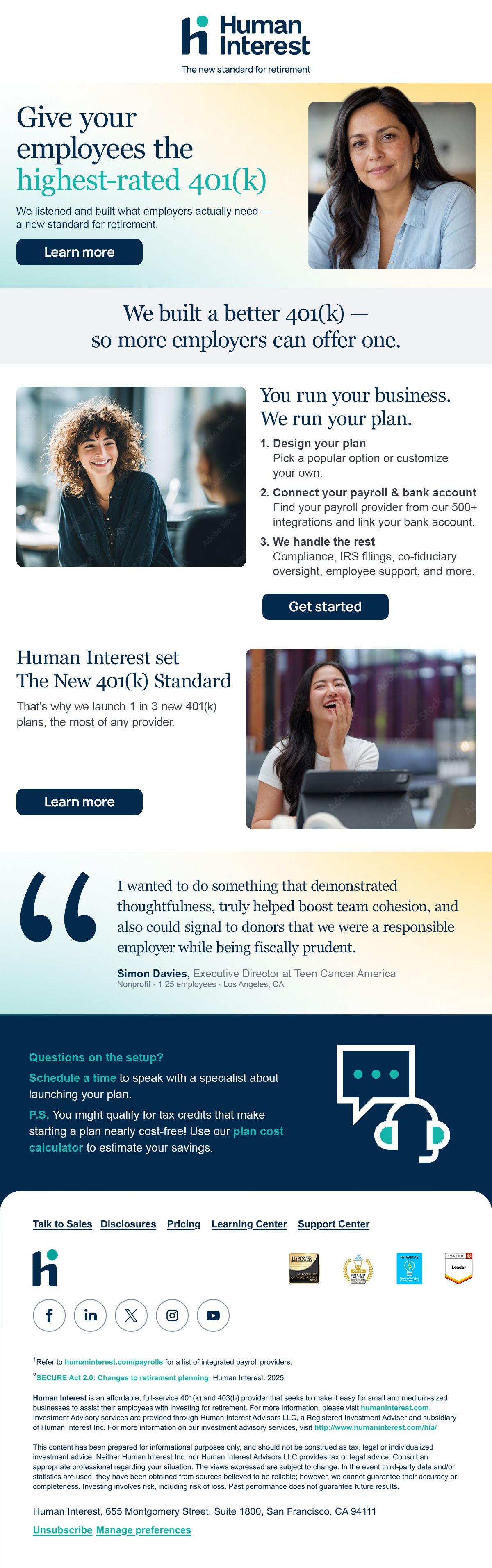
Marketing and lifecycle email follow the same system as the rest of the brand — Lora headline, Manrope body, one Atmosphere per block, single primary CTA, and a quiet, compliant footer.

Marketing — full send
Marketing — alternate layout
Email rules
Logo always centered in the header — white logo on navy/dark sends, navy logo on white sends
One Atmosphere behind the headline only — never behind body copy or footer
Lora headline, Manrope body — one emphasized phrase in teal italic max
Subject lines lead with the benefit, never with "Newsletter" or "Update"
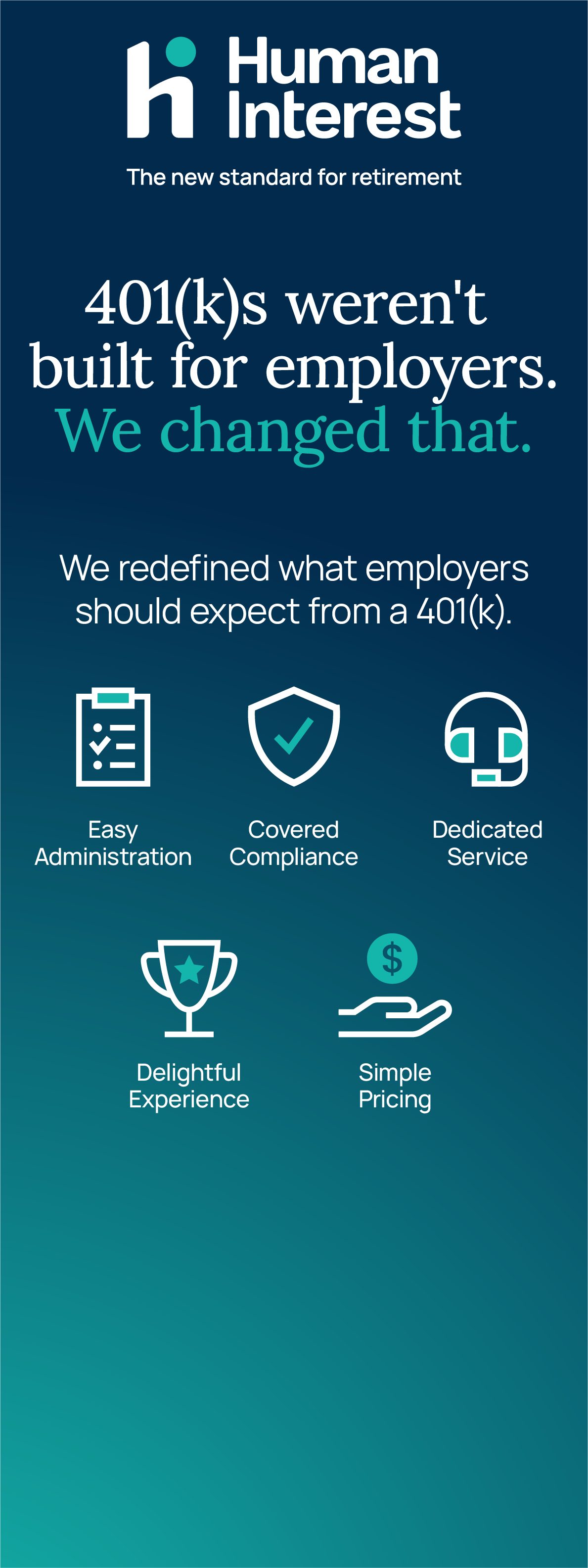
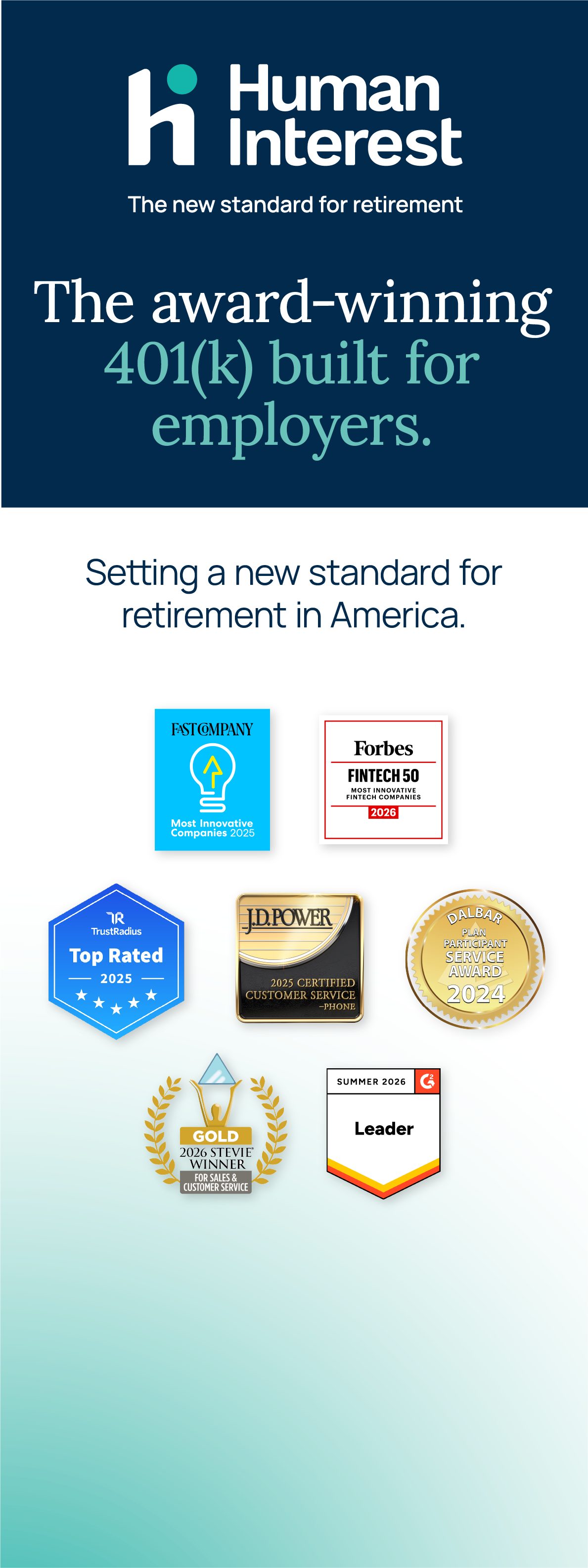
Pull-up banners — 33"×80"

Three banner variants for event use — Depth (navy) for high-impact messaging, split light/navy for award and social proof. Always include the logotype. Key messaging should always show in the top third of the canvas to ensure eye-height communication. Try diligently to keep the bottom third devoid of any important messaging.

Human Interest pull-up banner — 401ks weren't built for employers
Human Interest pull-up banner — The 401k built for employers
Human Interest pull-up banner — award-winning 401k
Event backdrop — 10'×10' inline

Back wall treatment using Atmosphere: Clarity (teal) on white. Icons reinforce the value proposition at a glance. No hero photographic images on the backdrop — reserve direct eye contact for pull-up banners.



Human Interest event backdrop
Event & print rules
Radial gradients only on white backgrounds in print — never on color fields
Atmosphere: Depth (navy) approved for all event applications
Back wall: secondary voyeuristic image — subject not looking at camera
Pull-up banners: hero image preferred — direct eye contact, real workplace
Counter wrap: navy with teal halo Atmosphere — keep it clean, URL prominent
CMYK: Navy 100/63/12/67 · Teal 81/0/39/0 · PMS 7463 C + PMS 326 C
Tradeshow booth mockup

Full booth setup combining the event backdrop, pull-up banner, and a branded counter. Atmosphere: Clarity (teal) on the backdrop, value-prop icons at a glance, staffer front and center at the counter.
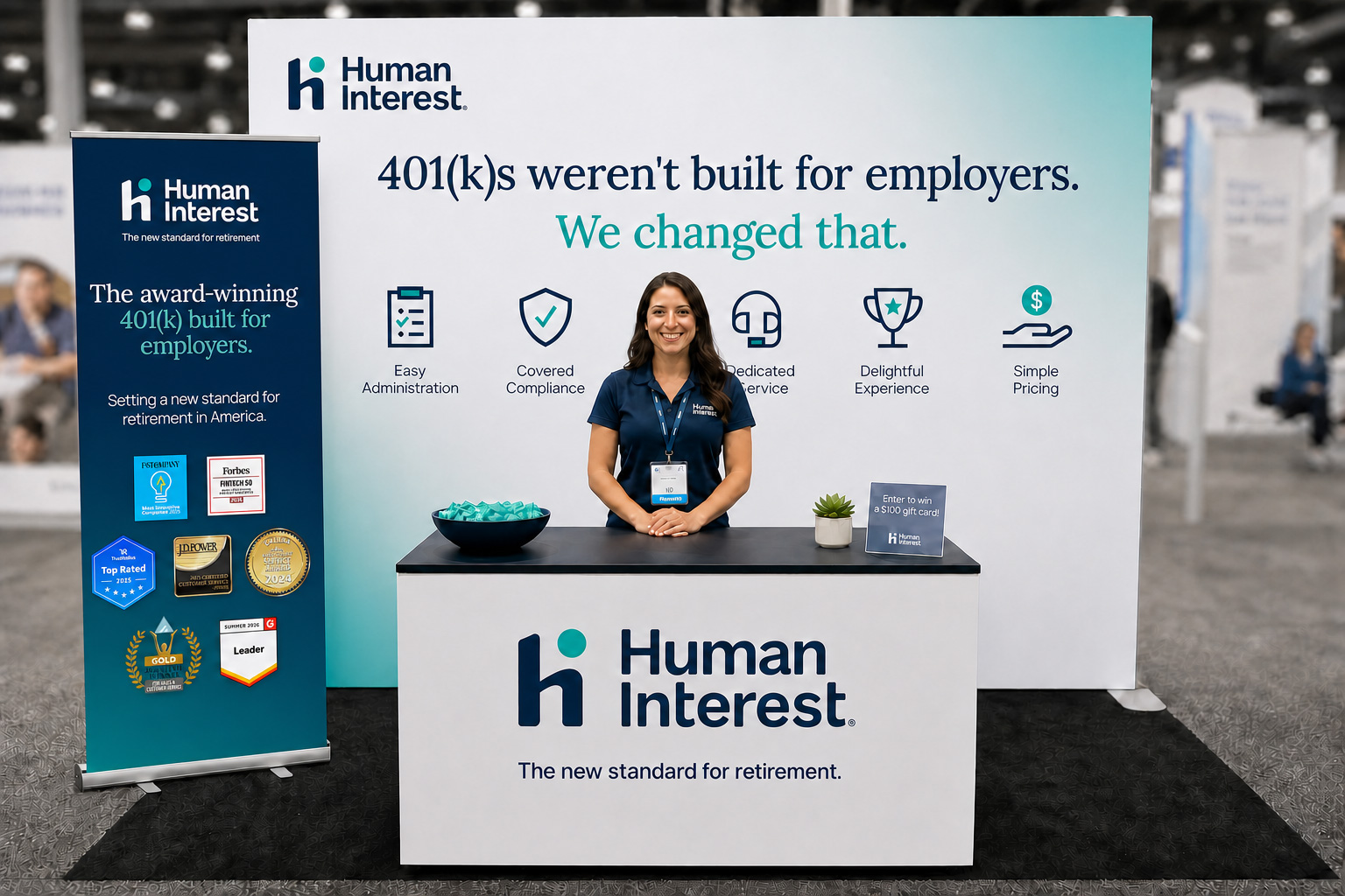
Human Interest tradeshow booth mockup